Lux Aeterna: Creating A Singular Card Game

Collaboration is one of the best ways to push your creativity. When renowned board game designer Tony Boydell approached me to create the artwork for his latest project I saw just such an opportunity.
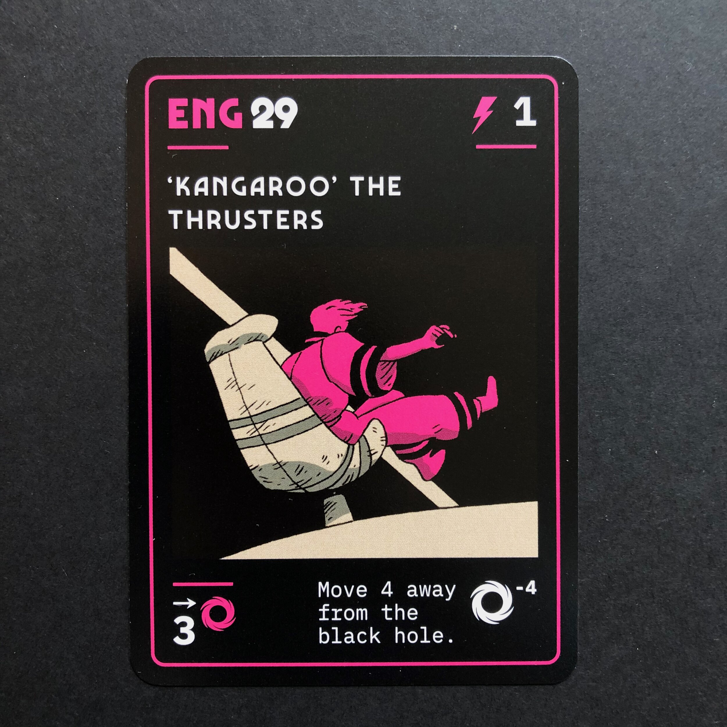
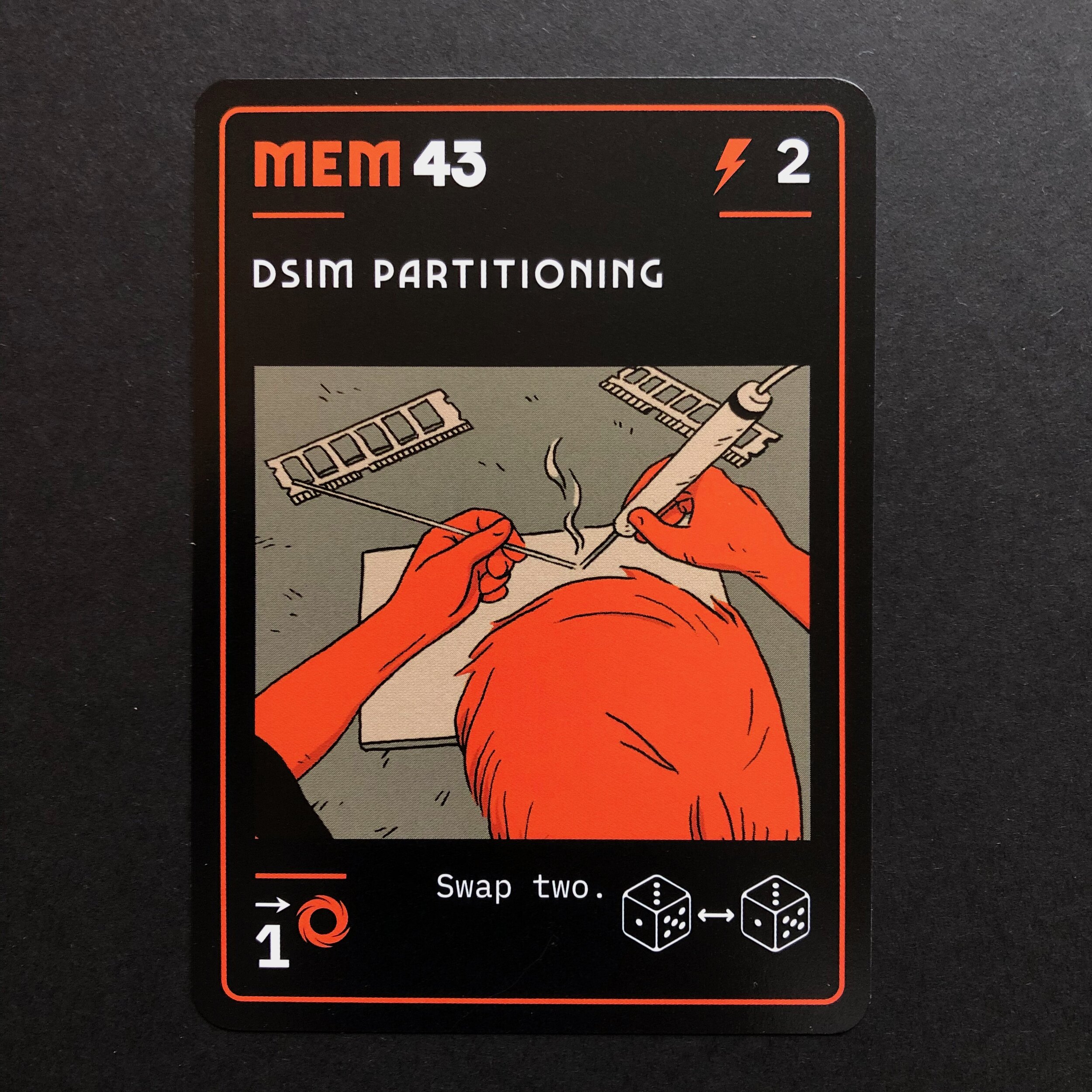
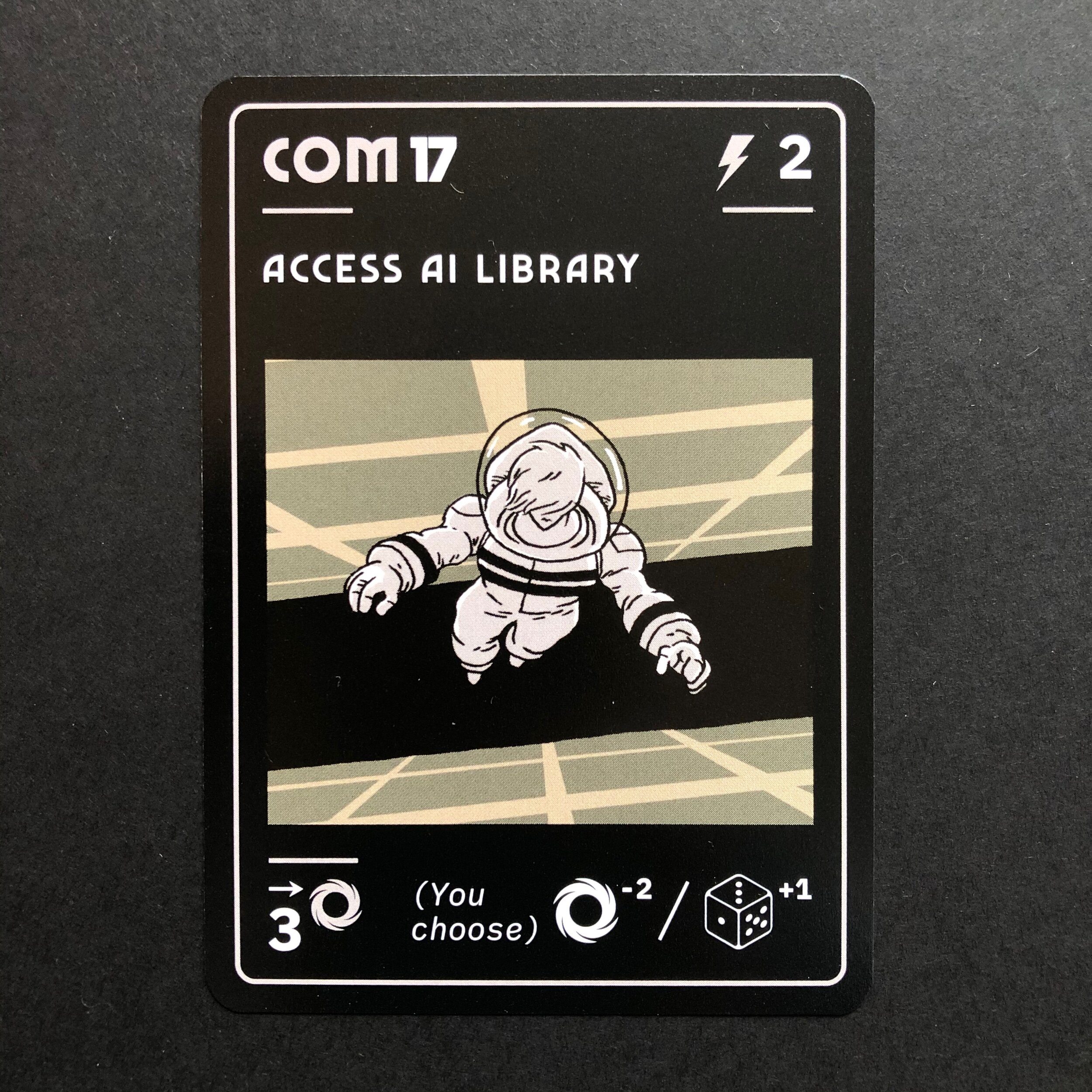
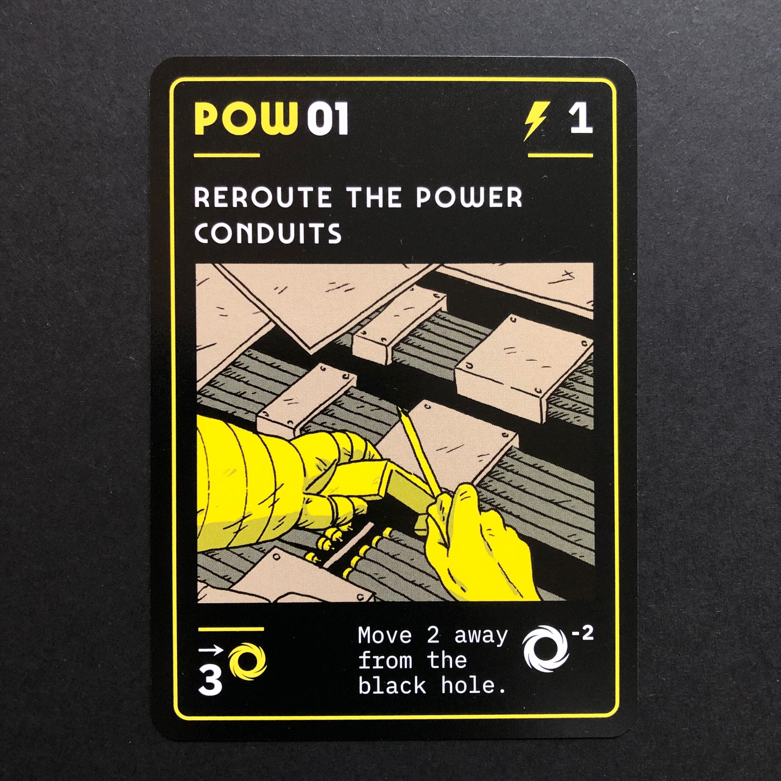
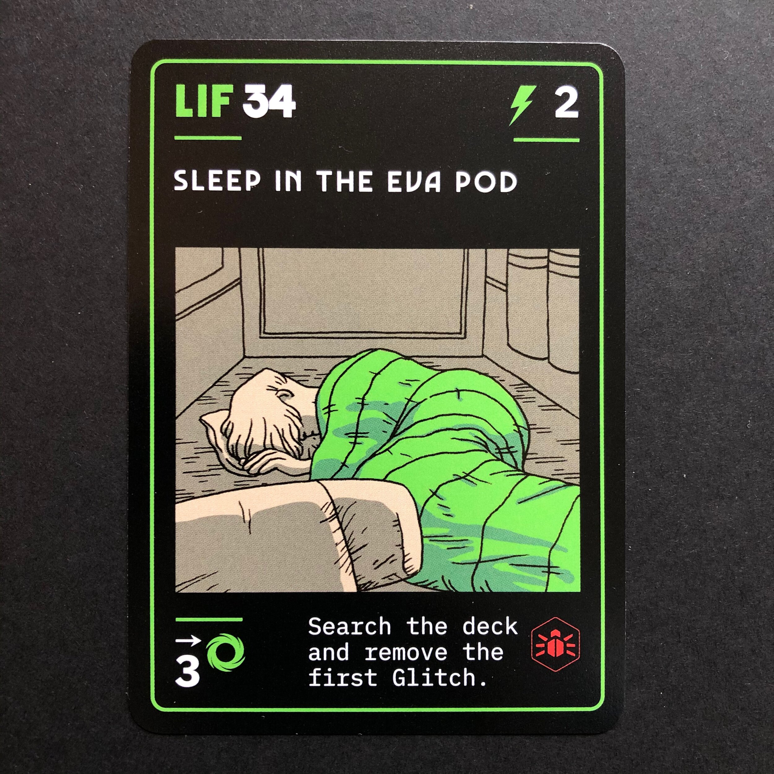
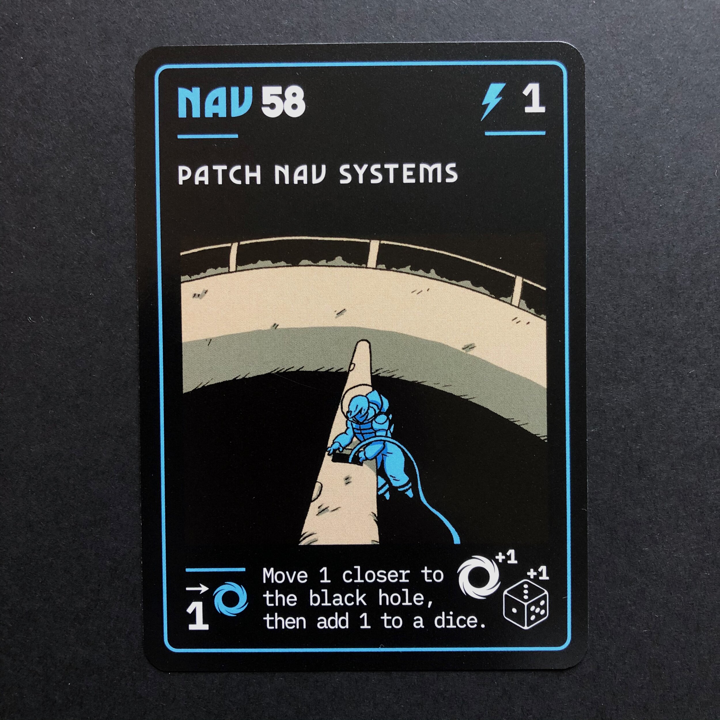
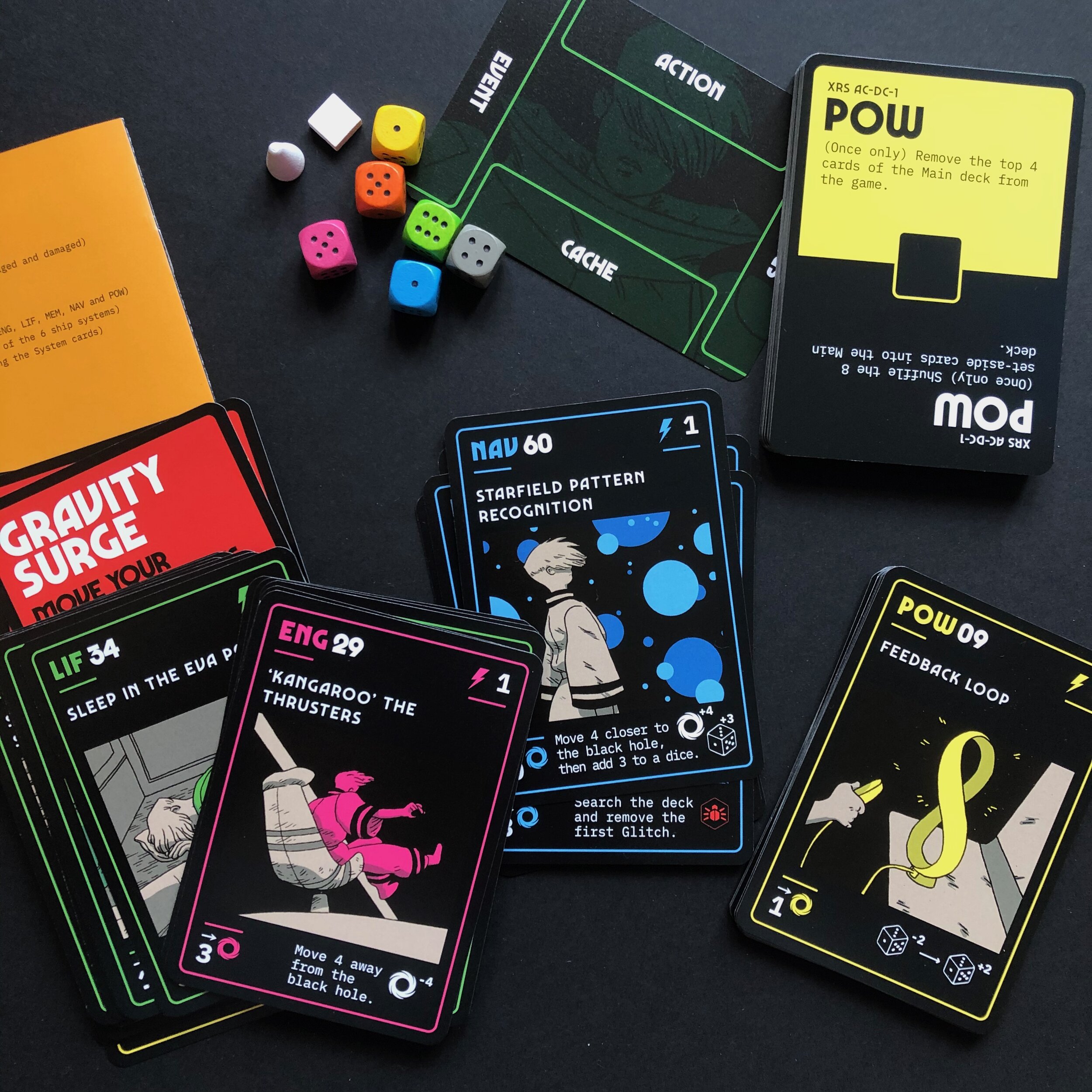
Lux Aeterna is a damn fine single-player card game, ingeniously balanced for frantic 15 minute play sessions. Like a sci-fi solitaire, the player navigates a deck of cards that depict a spaceship’s peril as it moves closer to a black hole. And although all games create a narrative Lux chaotically builds a tale of impending, unavoidable disaster by framing a new terror in each card. For me, this randomly-generated narrative was an opportunity to go beyond layout and illustration and create a fractured but coherent artwork that filled the spaces left open by the game itself.
The scope of the project was daunting - 100 cards with over 60 unique illustrations - but the route was fascinating and took me through the visual language of space-bound science fiction, from Chris Foss’s book covers and Moebius’ graphic novels to Leiji Matsumoto’s space opera manga. Underlying all of these, as a touchstone of paranoia and peril, was - of course - Stanley Kubrick’s 2001: A Space Odyssey.
Tony had an initial vision for each card and imagined the solitary ship’s occupant as a recurring presence, helping to articulate a sense of terror. After riffing through initial concepts we agreed on the direction for the images, then I focused on card layouts and set about creating rules that would preserve clarity for the player but also work with the illustrations to frame the Lux Aeterna world.


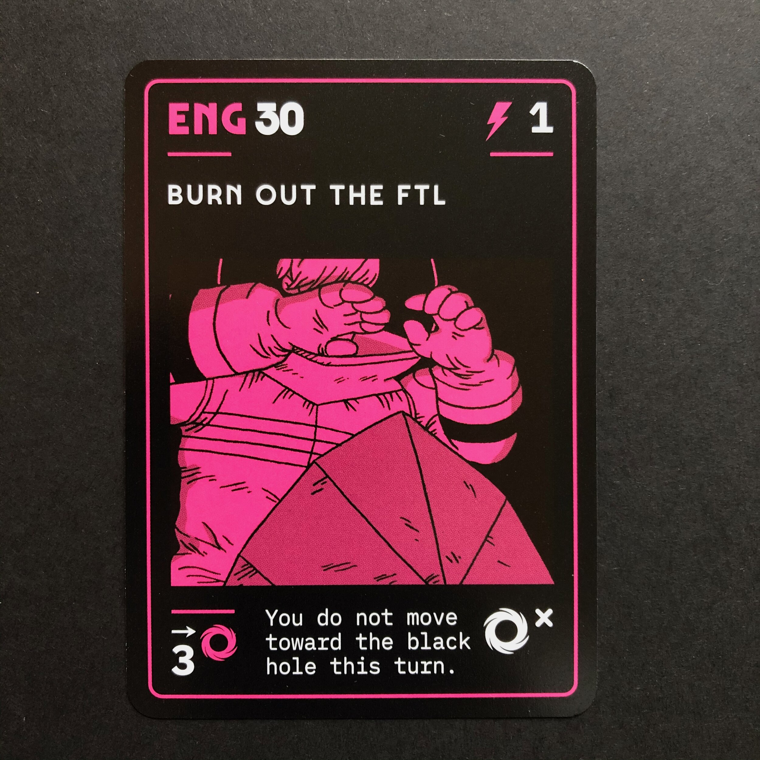
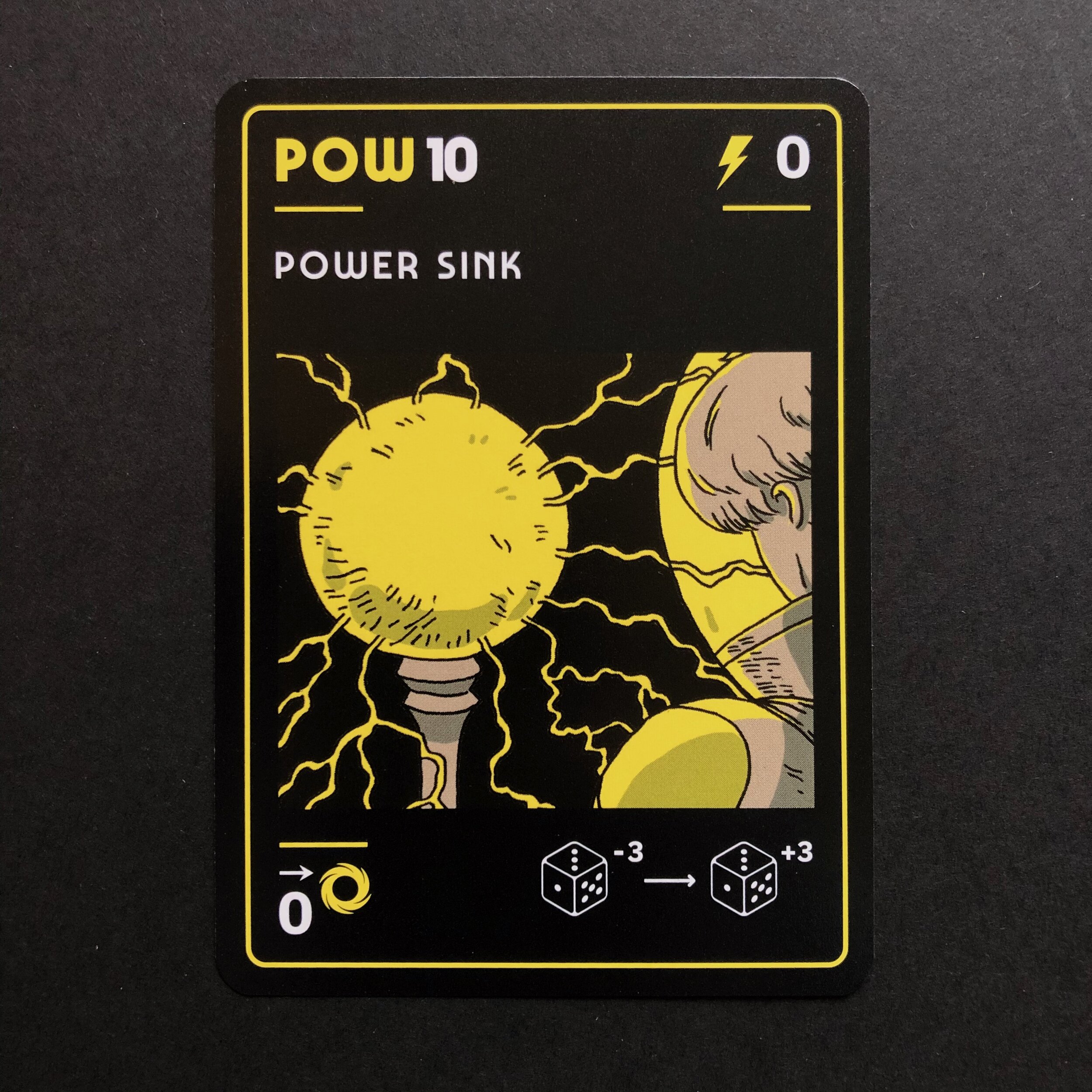
Although I’ve designed dozens of digital games this was my first card game and I was conscious that legible layouts were essential so that playability isn’t compromised. Luckily, Tony had already shown the way here as well, taking inspiration from Kubrick’s 2001 in the naming conventions for each card ‘system’, with three-letter abbreviations standing for the ship’s six vital systems: POW (power), COM (communications), ENG (engineering), LIF (life support), MEM (computer memory), NAV (navigation). Card layouts would stand in for the ship’s interface.
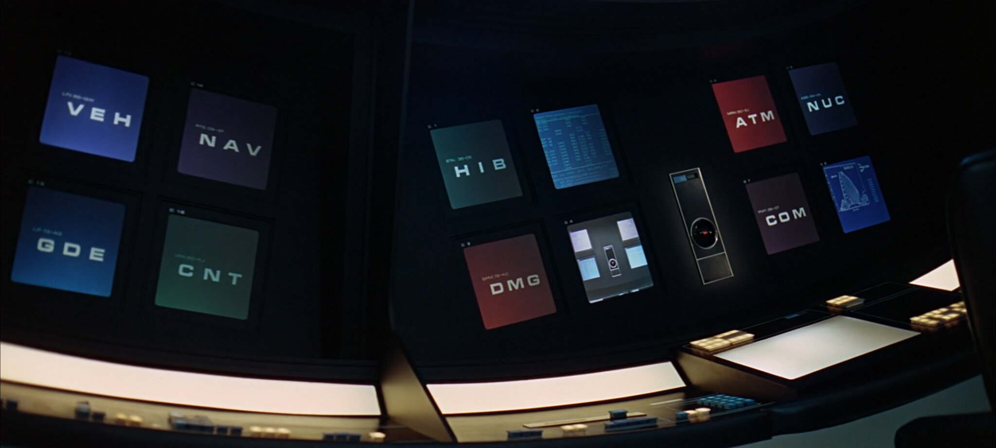
System monitors from 2001: A Space Odyssey
For me, 2001 is the finest example of a coherent, fully-realised sci-fi world, a staggering feat of imagination with enough rigour and foresight to predict the theoretical as fact. I immersed myself in Kubrick’s film, re-watching for sheer pleasure but also stepping through stills to understand the breathtaking detail in the production design. Inspired by these minimal interfaces I saw how choice of font would affect the success of the design: for body copy, where legibility at small point sizes is required, I scoured articles like Dave Addey’s brilliant investigation into the typeset’s of Kubrick’s film, choosing IBM Plex Mono to stand in for what the consensus suggests was IBM’s Manifold font; for titles and headings I opted for the wonderful Marvin Visions, a reinterpretation of Michael Chave’s evocative book-cover stalwart created for the Visions science fiction magazine.
Working through the illustrations was an utter joy. I love the way each card presents a moment of drama that, when put together in a play-through, creates a story that also allows players to jump around a timeline. Ultimately, this is the great thrill for me, working within the lines of narrative, exploring the unspoken. The story is half-known, a piece of a thing, shifting and re-connecting not just with each play session but also, thanks to Tony’s ingenious design, from moment to moment, turn to turn.
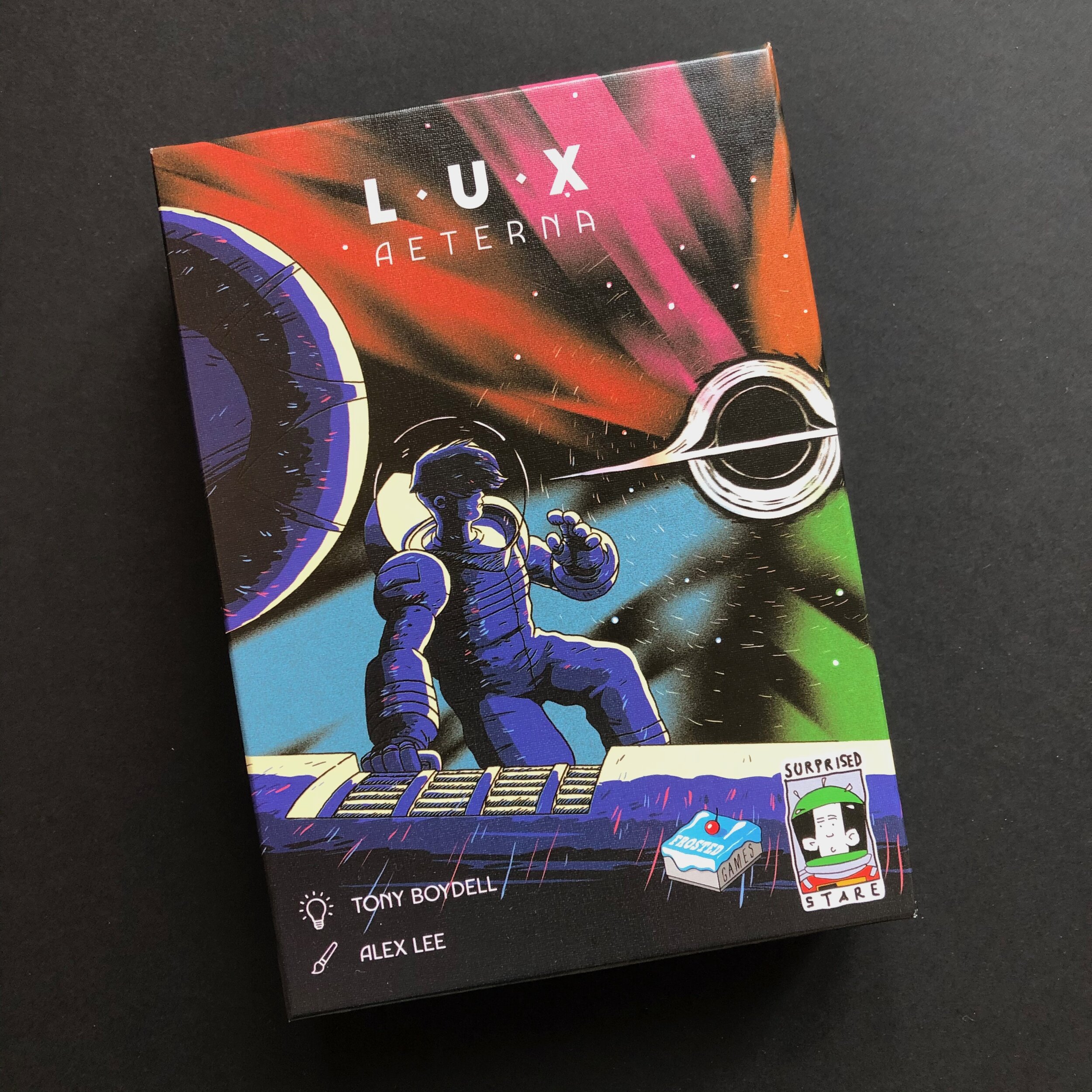
It would not have been possible to complete this project without the support and contributions of Alan Paull of Surprised Stare Games and Matthias Nagy of Frosted Games.